


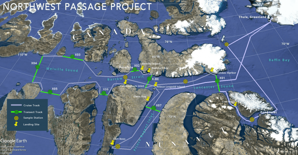
 Expedition map of Northwest Passage. Project route and destinations were added after user testing.
Graphic: Inner Space Center/Northwest Passage Project.
Expedition map of Northwest Passage. Project route and destinations were added after user testing.
Graphic: Inner Space Center/Northwest Passage Project. A FutureProof Blog Post.
Author’s note: After posting this story, Reuters reported the Northwest Passage Project discovered microplastic in an isolated stretch of the Canadian Arctic.
Despite digital access to well-nigh everything, science communication is not quite where it should be. Data, data everywhere… and so little understanding? Does access to science communication inevitably lead to greater public understanding of science, its discoveries, and their impact? Does access to online data sets inevitably lead to full comprehension of available information by scientists?
Whether people are accessing information online in their roles as members of the general public, or as scientists and researchers, the answer is a qualified “no,” even when it comes to events that will impact all life on earth in some way.
Communicating complexity is an uphill battle
The need for effective science communication increases with the complexity of the subject matter. This summer, notable research expeditions are sailing into newly-accessible Arctic seas to investigate scientific questions related to climate science. These missions are extremely difficult to stage, often requiring herculean efforts by scientists and technicians over several years in advance of sailing. Notable are MOSAiC (Multidisciplinary drifting Observatory for the Study of Arctic Climate), a year-long effort sponsored by the The Alfred Wegener Institute Helmholtz Centre for Polar and Marine Research (Europe), and the Northwest Passage Project, sponsored by the National Science Foundation (United States).
Science communication and scientific research face obstacles common to digital content:
- An uphill battle to get past the media “noise” confronting all users daily;
- Inward-facing information presentation (assuming users know what they are looking at);
- Varying levels of prior knowledge;
- Inconsistent user experiences;
- Tension between what a source wants to communicate versus what the user needs to know.
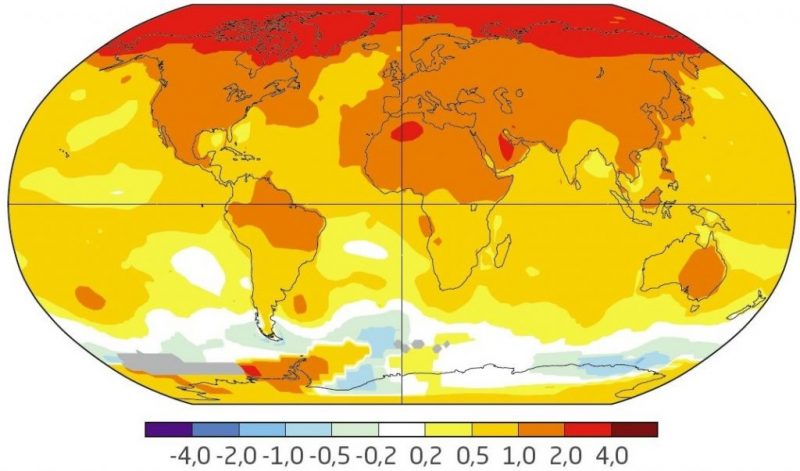
Near surface temperature changes 1970-2017 as seen at MOSAiC website quickly conveys the significance of the Arctic. Graphic: NASA GISS, https://data.giss.nasa.gov/gistemp
The findings from these Arctic expeditions will have implications for us all, including governments with their own ideas about how to use this unique part of our planet. Will the research findings reach the public in a meaningful way? Will the public have an informed voice on what happens next to this global treasure? Will average people understand the impact of climate change to their lives? Will scientists be able to easily access the data generated by these expeditions?
An abundance of data, missing the target?
We all know that global access to information does not demonstrably lead to comprehension of that information, or the ability to discern factual information from disinformation. Even when provably factual information is relevant to life on Earth – our collective and individual lives – the abundance of data being produced may not be meeting its potential to truly affect and inform public life worldwide. This is caused by a failure of science communication as well as an intentional derailing of facts (e.g., “the earth is flat”).
Recent studies of user interaction with everything from complex data sets to simple science engagement websites demonstrate common themes impeding comprehension, regardless of educational level or technical sophistication.
Solving the conundrum of making rich information accessible and resonant to the people who need it most would require a rethinking of assumptions that continue to plague even the most well-intended projects. Recent studies of user interaction with everything from complex data sets to simple science engagement websites demonstrate common themes impeding comprehension, regardless of educational level or technical sophistication.
Using Arctic exploration as an example, for the general public these assumptions can include:
- Overestimating prior knowledge (assuming people know where and what the Arctic is);
- Overestimating attention span (the “wall of text” problem);
- Underestimating a user’s need for orientation (who, what, when, where, why);
- Assuming users do not care about the identity of the sponsoring agency, or that they only care about the sponsoring agency (impacting credibility);
- Misunderstanding how users seek and interact with information (user interactions are becoming shorter as speed becomes the sine qua non);
- Depending on users wanting to learn information beyond their immediate interest (a roll of the dice);
- Implicit bias against under-served communities, assuming they are not interested (seeing the digital product through the lens of a conventional “good education” in an era where education is less and less standardized);
- Assuming that translating technical or scientific language into simpler terms is “dumbing down” content.
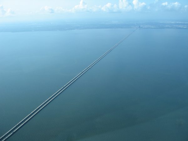
Motorists on Lake Pontchartrain are known to become disoriented at the middle of the bridge when they cannot see where they started or where they are going. Users of digital products experience a similar effect when they can no longer see the controls on a screen. Photo: Imgur
The comprehension problem for scientists interacting with the data sets produced by these projects can be affected by:
- Lack of immediate findability via Google (yes, Google is the scientist’s preferred search filtering tool);
- Inward-facing terminology;
- Overloaded and inconsistent user interfaces;
- The “Lake Pontchartrain Effect” – users interacting with large data sets lose orientation so they literally cannot see where they started or where they will end up, just as drivers on the notorious Lake Pontchartrain bridge near New Orleans become frozen when they realize they can’t see land at either end of the 26-mile bridge;
- Inability to easily download, save, and analyze data.
Surely the state of science communication is not that dire? Yet these basic misapprehensions about user needs are impacting the dissemination of heroically acquired, life-critical data every single day. The impact affects both average users and so-called “expert” users such as PhDs. Some science teams are now employing user testing to improve their connection to public audiences.
Iterating though ways to communicate science
This year, the Northwest Passage Project and its sponsoring facility, the Inner Space Center at the University of Rhode Island’s Graduate School of Oceanography, built upon evidence gleaned from users to inform its communication of the objectives and experience of oceanographic research to the public.
The Inner Space Center, an international hub for ocean exploration using telepresence, had previously conducted a three-year study of an interactive video kiosk project called Unknown Ocean, sponsored by the National Oceanic Atmospheric Administration (2011 – 2014). Over 120 visitors to Mystic Aquarium (Connecticut, US) were interviewed as they interacted with the Unknown Ocean touchscreen kiosk, which displayed high-definition video acquired by telepresence (Remotely Operated Vehicles, or ROVs) diving to 19,000 feet.
Among the results from initial visitor interviews:
- The ocean is the same depth all over the earth, and the bottom of the ocean is “sand, like a beach” (no connection of geology to the ocean)
- Some had no idea how deep the ocean can be;
- Telepresence was grasped by only a handful of users, and most who viewed the spectacular high-definition images stated they must have been photographed “in an aquarium,” undermining the entire point of telepresence;
- Scientific terms without explanatory context were opaque to users;
- Users expected the touchscreen to behave like an iPad (e.g., pinch, zoom, rotate behaviors);
- Reusing content created for a passive purpose in an interactive environment can cause problems.
Interestingly, users also reported that they placed greater value on real-time video over recorded video.
Inner Space Center scientists were surprised by the results from interviews; since science communication was the point of the kiosk, the team began to iterate and test three versions of the touchscreen and surrounding interpretive material. The addition of interpretive illustrations – video footage showing the diving of Remotely Operated Vehicle (ROV), a simulation showing users what a 19,000-foot dive looks like, and other similar assists – provided users the human context they needed to engage.
The subsequent Northwest Passage Project website underwent user testing in 2018; again, context was the issue for science-adjacent members of the public. Users asked: Where is the Northwest Passage? Why does it matter? When is the expedition taking place, or is it already over? Will they be at sea, or will they be stopping somewhere? And who is going?
This last question proved the most intriguing. Surfacing the presence of university students on the expedition, and the presentation of Facebook Live events streaming from the Arctic increased user interest in the Northwest Passage Project. Hearing from non-specialists via blogs and video democratized the expedition, making it more relatable to the average viewer.
If society is to to realize its investments in science and technology, it will have to become agnostic about its approach to digital communication. It will need to be open to what is rather than what one wishes would be.
Meanwhile, in Europe, the MOSAiC expedition website places humans squarely at the heart of the year-long project, using images and graphs to quickly convey the scale and reason for this multi-national undertaking. (As well as a touch of drama in copywriting, which does seem merited by the sheer size of the project.)
Science teams and the willingness to listen to users
We are living in a time that demands scientific inquiry and the comprehensible dissemination of results to the public. Scientific investigation – be it on board an Exploration Vessel in the Arctic, or in a research lab – is understandably expensive in time and effort. If society is to to realize its investments in science and technology, it will have to become agnostic about its approach to digital communication. It will need to be open to what is rather than what one wishes would be.
Despite the anthropomorphization of machines such as the Curiosity and Opportunity rovers, it seems we still want – and value – a human voice, a human face, to connect to meaning. The human face of the scientist, the human face of the participant, the human face of the user.
Ultimately, science communication relies on user interface. These crucial entry points to products as complex as data sets or as simple as science outreach must speak with a human voice, one as resonant as that of Astronaut Neil Armstrong in 1969, as unscripted as that of a college student beholding the Arctic expanse. Without those “voices” an audience is simply trying to thrash its way through facts. And the user interface does, in fact, speak.
Author Information
Cia Romano is Editor of FutureProof, a blog of the IEEE Society on Social Implications of Technology. She has been a Consultant on the Northwest Passage Project, providing digital strategy and user testing.
About Future Proof
Future Proof, a blog of IEEE Technology and Society, seeks to open a dialog between formal studies on the societal implications of technology and the daily existence of all people.
 JOIN SSIT