


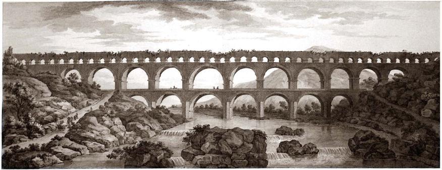
 Figure 1. Pont du Gard aquaduct in 1804 by Charles-Louis Cler’isseau.
 The Decline and Fall of Humane Public Infrastructure
Few people would celebrate modern infrastructure networks as magnificent beacons of our civilization: our powerlines and pipelines are drab, unsightly intrusions on the landscape. Reflecting on this, the humane philosopher Alain de Botton points out the Roman aqueduct at Pont Du Gard in Southern France (Figure 1), which is now a famous tourist attraction even though it was built for the dull task of supplying municipal water [2]. Wisely, though, the Romans built it, and many others alike, for both beauty and function, brightening citizens’ views while slaking their thirst. Indeed, so lovely is the Roman aqueduct of Segovia (Figure 2) that it is featured in the emblem of that province. I fear that today we are not building network infrastructure that is worthy of central billing on a coat of arms. While it is true that North Korea features a grey latticework transmission pylon on their national crest (Figure 3a and b), I don’t think this reflects popular tastes. Why do the Romans wipe our eyes on this: why can’t modern engineers build beautiful transmission towers as soaring and inspirational as the grand bridges and aqueducts of old? The term pylon comes from a monumental feature used in the sacred architecture of ancient Egypt (Figure 4): let us have the ambition to regain some of this majesty.
Our power lines and pipelines are drab, unsightly intrusions on the landscape.


Figure 3. Two regional emblems, showcasing public infrastructure of different eras. (a) Emblem of North Korean, which depicts the Sup’ung hydroelectric dam and its attending high voltage transmission tower. Drawn by Sshu94 CC-BY-SA 4.0. (b) Emblem of the Province of Segovia in Spain, which includes the famous Roman aquaduct. Drawn by Heralder CC-BY-SA 4.0.

Figure 4. Pylons at the temple complex of Karnak, near Luxor in Egypt, by Albert Henry Payne circa 1850.
Wisely the Romans built aquaducts for both beauty and function.
With this article, I want to articulate three design principles, which can humanize and redeem electricity infrastructure, as follows:
- National distinctiveness: Using an attractive form and consistent color to create a regional “sense of place,” where attractively designed electricity pylons are a fond reminder of home and an indicator when a frontier is crossed.
- Legibility of function: Good design can tangibly depict how each trans-mission tower is an integral and functional component of the cohesive electromechanical system that ships power around our countries. This invites engagement and rewards curiosity.
- Locality and place-making: Humanizing details and respect for localities can allow individual pylons to become memorable community landmarks.
Nation-Spanning Networks are Often Charming
In a comprehensive treatment [3] of attitudes to high voltage power lines in the American landscape, Levy collects various descriptions of their esthetic impact: “aerial sewer,” “manmade objects d’horror,” “desecrated landscapes,” “aerial junkyard,” he concludes by noting that transmission pylons “provide stark, highly visible evidence of giant, ill-understood systems of power generation, as well as serving as reminders of a now disdained modernist, machine-age esthetic.” This is a good diagnosis of the problem: high voltage power lines appear as an imposition on the landscape, degrading skylines with their unpainted latticeworks of industrial gray steel. They are also illegible and mute, disclosing little of their purpose or history. They have a spartan industrial appearance, with few concessions to beauty and little attempt to harmonize visually with the communities they serve. Their looming presence is alienating: these grim towers symbolize technocracy and over-centralization, evoking remote planners to draw very straight lines on maps.
The most fundamental requirement for a humane electricity infrastructure is creating a standard design for an electricity pylon that is visually attractive and elegant.
Humane infrastructure can enhance the landscape, like a scenic canal, a heritage railway line, or a quiet bridleway. These networks crisscross open space, provide local landmarks, and provoke a sense of connection and possibility. Canal bridges and railway stations were often built for elegance and harmony with the landscape, and this is why they are widely appreciated today. Network infrastructure can simultaneously enhance the sense of both the reassuring “here” and the inviting “there”: while a quaint railway station is a landmark in its own right, its tracks lead invitingly off to other places, stations, and junctions. Likewise, locks, bridges and mileposts (as in Figure 5) punctuate and localize canal networks, which were once just functional transport infrastructure but are now charming public amenities.

Figure 5. Milepost punctuating the run of the Trent and Mersey Canal, humanizing this transport link and embedding it into the existing landscape. Photo by Milestone Society Sshu94 CC-BY-SA 2.0.
Another encouraging example is the iconic London Tube map, which is now a colorful emblem for that city and is celebrated on clothes, homewares, and many kinds of merchandise. The wide appeal of such diagrams means that normal people can connect emotionally with network infrastructures (see [4] for an attempt to represent a power system this way) Legible networks invite exploration and curiosity: think of a hedge maze or a children’s puzzle. National grids should be able to win some affection of this type.
National Distinctiveness: The Power of Consistent Form and Color
The red post boxes of the United Kingdom are a familiar emblem of that country and often feature in the photos that tourists take on their visits there. This shows the power of embracing a strong design vision and sticking with it: the striking red shade and distinctive shape create a memorable motif on streets across the nation (Figure 6). A postbox could be a bland and utilitarian piece of street furniture, but a little care in design elevates and humanizes it, and wins the affection of its user.

Figure 6. Classic red Victorian pillar postbox, now fondly associated with the United Kingdom. Photo by Sludge G CC-BY-ND 2.0.
A few simple points are noteworthy. They are kept painted in a vibrant color; decorative elements are provided in the form of the ornate royal cypher at the front and fluted cap to the top; the exterior is finished in high-quality cast iron with internal fixings concealed. By insisting on a humane and attractive design, and applying it consistently over space and time, the U.K. Post Office has enhanced the visual amenity of towns and cities across the country and has won the hearts of the British people. Electric utilities should emulate this with their powerlines, which are instead perceived as a blight on the landscape.
It would be tempting to use cheap-and-nasty materials for a postbox, as it is easy not to care about so bland a piece of street furniture as a receptacle for mail. Just erect the cheapest solution that will get the job done, and even (God forbid) cover it in advertising to eke out a little extra revenue. A lot of engineers think this way, which is absolutely a shame. A postbox on a busy street corner might have seen millions of people pass by over its long life (many of the postboxes in the UK were erected in the late Victorian era). Each of these moments is an opportunity to brighten up someone’s day. Even if the cheering effect of an attractive postbox is quite negligible in a secluded area, surely the extra cost is justified when amortized across its long and highly visible life.
Therefore, the most fundamental requirement for a humane electricity infrastructure is creating a standard design for an electricity pylon that is visually attractive and elegant. For instance, consider the sleek winner of a recent architectural competition on this topic (Figure 7). Various other attractive and creative pylon designs are described in [5]. Architects and designers know how to make utilitarian objects appear graceful and attractive: there is nothing special about transmission pylons, which means they need to be eternally ugly. Engineers need to embrace the important skills that architects can offer here as esthetics do matter. Again, the most important thing is simply to get the basics right: there should be no exposed fittings, no bare metal, nothing cheap, or dirty-looking. Given the longevity of pylons, the template designs should not be too reflective of the prevailing architectural fashions, either (recall the tailor’s advice to a groom buying a wedding suit: those photos will be on the mantelpiece for a long time!). The template design will need to accommodate a “family” of tower types for the various operating voltage levels, and the different structural roles like termination, transposition, cornering, and suspension towers.
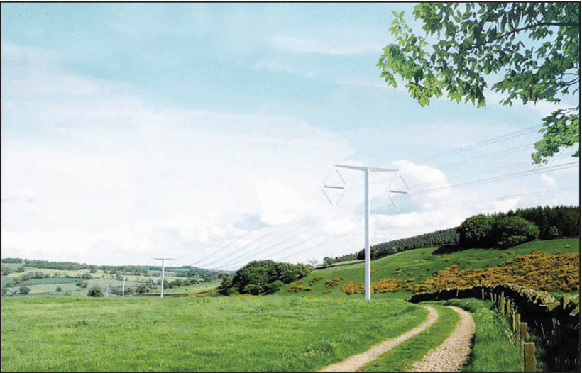
Figure 7. T-Pylon design by the Bystrup architectural firm, which won a contest to find a more esthetic standard pylon design. Image by U.K. Department of Energy and Climate Change CC-BY-ND 2.0.
So, once the skillful architects and designers have done their work, and resulting attractive standard designs for a harmonious range of transmission pylons, it is time to choose a distinctive color scheme. Given their height, transmission pylons will always be a highly visible feature in the landscape, so one needs to bear this in minds to show a little national flair. People can grow fond of red postboxes, so maybe they will come to associate yellow transmission pylons with the green fields of home. Electricity infrastructure should not look the same dreary grey the world over: each vibrant color, consistently applied, can distinguish each particular region. We should harness the ability of powerlines to “create a place as well as intersect landscape” [6].
Order and regularity in the appearance of transmission infrastructure are important: this fact signals that somebody cares, and is trying their best to keep the physical network look neat and consistent. Furthermore, by having a recognizable and distinctive appearance, the network takes on an identity as a cohesive whole, a unified synchronous system spanning the nation and serving its people. An anonymous mishmash of pylon designs will not evoke this at all, and instead creates a sense of carelessness and disorder. At the same time, some variation within an orderly pattern is inherently appealing [2]: the natural variation of the pylon size and function provides this, as do the localizing details particular to each tower.
Legibility of Function: Rewarding Curiosity
To the passerby, a transmission pylon reveals nothing of its purpose or wider context: where do those wires come from, and where do they go? Who put this here, and when, and why? An anonymous latticework pylon is mute to such natural human interest. Instead, good design of electricity infrastructure should promote legibility by providing cues that reward such curiosity, revealing what each specific pylon is for. This could include attractive markings signposting the origin and destination of the circuit it carries, as well as its operating voltage and maximum power capacity. Each pylon could be numbered, too, to punctuate the progress along its route, like mileposts on canals or railways, or pearls on a necklace.
Although these details might invite a little curiosity, it would be even better if the instantaneous powerflow could be indicated, to give a sense of dynamism, movement, and purpose to these structures. A mechanical dial on each pylon could show the prevailing Megawatt loading, and a wind vane style arrow could point out the flow direction. For a more modernized approach, light could be projected onto the conductors themselves, with intensity and color depicting the prevailing loading level.
Such design features would be in line with the idea of Wuebben [6] who argues that “power lines are actors and convey a certain agency” and asks “what meanings could electric infrastructure transmit to viewers?” Good design should evoke the inherent dynamism of a thrumming circuit shipping clean power directly from a windswept hill to the heart of a city. Depicting the fluctuating powerflow carried by a line animates the electricity infrastructure and would allow normal people to gain some appreciation for the operation of the national grid.
Locality and Connection: Embrace Pylons as Landmarks
The height of transmission towers indicates that they will always be prominent in the landscape, so it makes sense to bear this in mind and provide each with some decorative elements to make them distinctive local landmarks. So, the standard designs should provide some space for cosmetic flourishes specific to each pylon. Individual variation within a consistent pattern is attractive and charming.
While the technical legibility details would give some “personality” to each pylon, some more humanizing touches would also be widely welcomed. For instance, each pylon could provide an alcove for a sculpture or art piece. So, it might be nice to commission attractive animal emblems for every tower in the network. This could form a charming motif across the system, providing landmarks and aide-memoires to ordinary people: “Take the left turn after you see the transmission tower with the statue of the otter.” The quaint pubs across England are often named after the pictorial signage that identified a particular tavern in pre-literate times, hence names like “The Dog and Duck” or “The Horse and Hound.” Such pastoral imagery is humane, memorable, and uplifting, and these are the very qualities that electricity infrastructure most severely lacks.
The particular community surrounding a pylon could also be celebrated in its design. For instance, a stripe of the local county colors could be accommodated, as could the crest of the nearest town. The design should signify both locality and connection, embedding the pylon in its community context and depicting the outward links provided by the circuit it carries.
Conclusion
I have attended dozens of conferences devoted to power systems engineering, where every minor subfield of the discipline is discussed in exquisite detail. Yet, I have barely heard a whisper on the brutalizing effect that ugly pylons have on lovely landscapes. Some engineers seem to take a perverse pride in this, signaling their supposed technical sophistication by dismissing such “soft” concerns as esthetics. This is a real shame, as it shows a gauche disregard for the concerns of normal electricity users. We can do better than erecting transmission pylons that look as cheap and functional as possible. We need to provide the cosmetic ingredients that allow normal people to feel a sense of ownership and connection with these vital assets.
Anything can be made beautiful with a little care and attention. If engineers continue to ignore this simple wisdom, communities will continue to resist the new powerlines that are desperately needed to connect wind and solar generators. This article has discussed three simple design principles to create humane and timeless infrastructure networks, and the need for this will only grow as we decarbonize and electrify our energy use. It is time to embrace a green future without the gray steel.
 JOIN SSIT