


 Crisis management app.
 In the wake of crisis situations that can bring tragedy through the loss of human life, or the devastating destruction of homes or buildings, people begin to recognize the need for better processes and more advanced systems. Crisis and emergency notification systems that utilize the correct communication channels can help to quickly disseminate alerts and information both during and after a crisis. The success of these systems is closely linked to our society?s trend of producing more advanced electronic devices that allows users to stay connected and receive information faster than ever before. It is now not uncommon for people to carry numerous devices including tablets and smartphones. Not surprisingly, current emergency communication systems now utilize both SMS messages and phone calls. The most recent update to alert systems has included the adoption of a standard protocol for consistent alert message dissemination over different communication channels with the Common Alerting Protocol (CAP) [1].
Crisis and emergency notification systems that utilize the correct communication channels can help to quickly disseminate alerts and information both during and after a crisis.
In addition to widespread use, the exploration of smartphone applications for use in emergency communication has been motivated by the potential to reach users through the delivery of fast push notifications. Pairing this technology with other key functionalities truly enhances the system design and processes of emergency alert systems with regard to efficiency, effectiveness, and reliability. After all, communication does not just hinge on delivery time. For instance, geospatial location has been recognized as a vital element for use with emergency notification systems, yet it is almost completely absent from most university systems. User location awareness allows for a system to provide specific messages to users based on their current position. For an alert system, this message differentiation is critical to limit user confusion and allow campus or emergency personnel to direct specific instructions based on the user’s proximity to the crisis which has triggered an emergency alert. Finally, the users themselves need to be addressed. Usability studies and device usage surveys are another missing element for alert notification system research that can provide critical design guidelines and reveal important user privacy concerns and usage trends which can further alert notification system research and guide the development of the systems themselves.
This research focused on all of the beginning stages of the development of a software application for an optimized crisis alert system. The proof of concept for this research was a geospatially aware push notification application for smartphones modeled for integration with the entire process flow of the current and operational Virginia Tech campus alert notification system, VT Alerts. The proof of concept fits as an optimized addition to VT Alerts and utilizes the geospatial location of the users kept on the client device to allow for the appropriate alert notification messages. The design iterations and refinements relating to user privacy, usability, and implementation requirements were tackled to enhance the application and usability of this research. Design changes focused on user location privacy and a survey of 1057 representative users of the Virginia Tech eampus population was conducted to gain an understanding of mobile device usage habits and mobile application preferences. These results can aid the potential release and communication of a similar geospatial location mobile alert notification application and show the value of the iterative design usability engineering processes that involve interviews and studies with actual users.
Related Work
Emergency management personnel need reliable yet flexible systems to react properly and quickly. Due to the high variability of crises, system design is complex and task automation and human decision and control must be balanced [2]. Research shows the pressing desire and need for emergency systems [3]. However, system design and effectiveness is linked to sociological factors. Traditional alert systems utilize SMS messages and phone calls based on the premise that today users are more connected than ever before. One such system, the FEMA Wireless Emergency Alerts (WEA), utilizes commercial mobile service providers (CMS) to send messages to capable cell phones in range of selected cell towers [4], [5]. Similarly, universities have implemented alert systems utilizing email, voice messages, loudspeakers, electronic displays, and text messaging [6], [7]. Benefits from the use of social media for disaster response and recovery and communications are also being uncovered [8], [9]. New technologies, however, present new concerns. User information overload or the perception of notifications as’Junk” can persist in many computer-mediated communication systems without proper organization and filtering [10]. Security and message validity is also a high concern [11] as this field advances.
Research is gradually advancing in the area of alert system technologies. Smartphone applications with specialized interfaces have been introduced [12]. Participation in large scale alert systems [13], sociological combined with technological factors [14], and the use of social network algorithms based on cellphone location to aid in decision making [15] have all been explored. Research groups have surveyed the impacts of SMS-based [16] and multicast-based [17] alert systems. In addition, the protocols for mass public communication systems have been evaluated [18]. Still, many design implications and methods have not been thoroughly investigated [19]. Geospatial information has been identified as important for integrating assessments, reports, and notifications into a “common operating picture” [20], and case studies have mapped crises as single, localized, or traceable points [3], [7]. When lives and response efforts rely on communications, no known optimizations or system analysis should be unexplored. Further research is needed to understand and create fast, reliable, and customizable systems.
System Design
The system design was aimed at providing an optimized alert system complete with functionality driven by the location of the individual user receiving the alerts. This functionality was balanced with speed and performance requirements, two critical variables for any system operating during high-risk and variable crisis situations. Overall, the communication channel chosen and the effectiveness of the system also had much to do with sociological factors. These can range from system adoption and actual use by the target population to the ability of the system to clearly communicate the notification to the audience. For instance, a single email delivered to an entire campus population simply stating “Fire in Academic Hall” may have a high coverage being sent to all the school email addresses, but may not be widely read by the users. In addition, the message itself is not very informative. What information to provide to users, in addition to the chosen communication method, and the user interaction with the system are all major factors for the design of an effective alert notification system. We gathered information on a current and operational alert system to define key optimizations and had the ability to interview and conduct studies with actual users of the emergency notification system.
VT Alerts is an in-house developed alert notification system at the Virginia Polytechnic Institute and State University. Through interviews with management, developers, and later studies with actual users, we gathered information as to the current requirements, potential optimizations, and current performance of the system. These influenced the design of the prototype addition to the system, specifically, a smartphone application capable of delivering push notifications to users based on their current location. This design not only allows the user to view a map of their current location and the location of the emergency that has triggered the alert, but includes a notification that is relevant to them. For example, the alert notification may include specific instructions to follow.
For instance, consider that a bomb threat has been called into a university. Those users currently located on campus may need to evacuate, but users located off campus will need to stay clear. This is just one simple example, but crisis situations occur suddenly and tend to be highly variable. It is therefore reasonable to expect that an alert system will need to provide flexibility in both the channels of message delivery and the message itself. The VT Alerts system itself has multiple communication channels to attempt to reach as many users as possible and in the hopes that if a particular channel, say an email, fails to reach a user, another channel may succeed, such as a loud speaker announcement. With over 50 000 users with multiple contact methods, VT Alerts utilizes SMS and phone calls to send over 100 000 notifications.
These methods are voluntary and must be signed up for, but other automatic emergency communication channels include the use of the website, university email, electronic message boards, sirens, and loudspeakers. Virginia Tech also plans to utilize push notification which, if widely adopted by users, would reduce the estimated time to reach eighty percent of the users from 20 minutes down to 3 minutes.
Virginia Tech will join other universities in the adoption of the LiveSafe application to help the community stay safe and informed.
We focused on the adoption and use of such an application and addressed privacy concerns and usability issues and findings after conducting interviews, a usability survey, and a usability study. Most recently, and after the conclusion of our usability studies, it was announced that Virginia Tech will join other universities in the adoption of the LiveSafe application to help the community stay safe and informed [22]. This is highly encouraging and will allow for the Virginia Tech community to actually utilize a smartphone application with similar features to those of our prototype. The results of our usability survey and interview results and findings reveal insights into the usage of such smartphone applications in the area of emergency management. We explored user preference, tendencies, and interface interactions related to our sample prototype application, but these can be more widely applied to advance our understanding of the design, development, and actual user use of such systems.
Usability Survey
Crisis and emergency notification systems that utilize correct communication channels can quickly disseminate alerts and information during and after a crisis.
The usability survey was meant to be a wide reaching and anonymous tool for gathering the personal mobile device usage trends of actual users of the Virginia Tech VT Alerts notification system. It also queried for user willingness to utilize a smartphone application for alert notifications. This survey was completed by a total of 1057 people. Participation was sought from all potential users of the VT Alerts system and contributors included graduate students, undergraduate students, faculty members, and staff members of the campus. The survey itself was online and consisted of 16 questions and estimated to take between 3 to 5 minutes to complete. The questions explored user trends related to smartphone usage such as device characteristics, device access, and connection routines, as well as user application downloading and usability practices. To limit any bias, the survey was presented as a mobile device usage questionnaire to benefit campus-wide communication research, and it was not until the final questions that an alert notification system was even mentioned. The contributions were recorded anonymously after participants were authenticated with their campus user id and password. This prevented repeat submissions and ensured participants were affiliated with the campus.
The survey results were indeed informative regarding mobile device usage and trends on campus. A staggering 94% of participants owned a smartphone. This high percentage was estimated by campus officials, but no formal queries or surveys had previously been conducted on campus to verify this claim. Other devices marked as being utilized included tablets at 17% and standard mobile phones at 6%. A total of 100% of the participants had some form of mobile device. The most common operating system was iOS, followed by Android, Windows, and then any other. A small 8% of participants never connect their devices to the campus network and a total of 92% connect one or more devices.
One of the most important findings from our survey was the fact that 96% of the participants reported that they have a mobile device with them at all times and 98% of the participants reported that they have a mobile device with them at all times when they are on campus. The break down can be seen in Figure 1. This follows with our initial assumption of the high device usage and supports the use of mobile device notifications for alert systems. The fact that 94% of participants own a smartphone also shows promise of the potential adoption of a smartphone application for emergency notifications.

Figure 1. The mobile device usage habits of 1057 participants by percentage.
Other questions from the survey related to user privacy concerns and their willingness to allow a mobile application access to their location information. These Likert scale questions began as general queries on how often the users allow location permissions for applications they download. The questions then began to inquire if users would be willing to allow location permissions if the application was for campus safety alerts, for communicating campus safety alerts as quickly as possible, and for communicating campus safety alerts based on the user proximity to a life threatening event. The results can be seen in Figure 2. When asked if they would allow an application access to the location services of their mobile device if the application did not store that location outside of the device, a total of about 65% of participants agreed or strongly agreed. When asked if they would download an application for campus safety alerts, those above neutral equated to a total of about 88%. Once the questions probed for allowing access to location services if it was for campus safety alerts, or for campus safety alerts to alert users as quickly as possible, or for campus safety alerts to alert based on user proximity to a life threatening event, the percentage of participants above neutral jumped to approximately 84%, 86%, and 93%, respectively.

Figure 2. The application permissions preferences of 1057 participants by percentage.
Finally, another question asked participants if they would want an automatic message sent to their mobile device for campus safety alerts. The percent of participants who either agree or strongly agree were 28% and 67%, respectively, for a total of 95%.
User & Location Privacy
The usability survey allowed participants to type any additional explanations or comments they felt necessary for each question. These comments uncovered a common trend among the participants who left comments. The general area of concern was privacy. One user mentioned that they only allow location access if they believed it was necessary for the application and many other users mentioned that they allowed it for map-based applications. On the other hand, some users simply stated “I want privacy” or “I worry about security from giving this information away.” Of those participants who decided to write additional comments, privacy was the common trend and battery drainage was only mentioned a couple of times.
As the survey results revealed, participants were much more likely to allow an application access to their location if it was for the purpose of receiving campus safety alerts and this could be traced in the comments sections. The same user who simply mentioned “I want privacy” and marked that he or she almost never allowed applications access to the location services of his or her mobile device, later stated “I want privacy other than in an emergency.” When asked if they would allow location permissions if the application only stored their location locally on their device, many people commented as to how would they verify this or trust the application. One user stated “I’m paranoid.” This user, however, was clearly not alone in his or her skepticism and this should be considered before the release of any application such as ours.
Finally, there was a trend of users who commented on the questions asking about allowing location permissions for applications to communicate campus safety alerts quickly or based on proximity to a life threatening event. Most participants who commented on these questions either wondered about the current system or made encouraging remarks. Some users asked what was wrong with the current system, VT Alerts, yet others were enthusiastic and answered “ABSOLUTELY” or “I like where this is going…” Even with all of the enthusiasm, there were some participants on the opposite end of the spectrum who would never give an application permission to access their location. These users, however, made up a very small percentage of the total number of participants. Therefore, this survey greatly supported the likelihood of wide adoption of a smartphone application for communicating emergency alerts.
Usability Study
The online usability survey taken by the 1057 Virginia Tech graduate and undergraduate students, faculty, and staff allowed us to gather general device usage trends, overall emergency alert notification application willingness, and other concerns left in the comments. However, to better explore the user understanding and usage of an emergency alert notification application, we created an interface prototype and conducted a usability study to interview users and document their actions and understanding when asked to run through several scenarios with the smartphone application interface. An interview transcript was read to the 12 interview subjects and their responses to questions concerning the VT Alerts system as well as our design for a new smartphone application addition to that system were recorded. Further, the users were prompted to demonstrate and explain their understanding and how they would interact with the functionalities of five different interface prototype screen shots. Once again, we sought participation from all categories of users on the Virginia Tech campus and held interviews with a total of 5 undergraduate students, 3 graduate students, 2 faculty, and 3 staff members. One participant was both a graduate student and current staff member, for a total of 12 participants. The interviews lasted approximately half an hour and involved the completion of a pre-questionnaire on basic demographic and background information, followed by the interview about VT Alerts and the new smartphone application design and optimizations. Then, participants were asked to elaborate on how they would complete tasks given the paper interface screen shots. Finally, the participants completed a post-questionnaire on their experience.
Information was gathered on the participants’ overall knowledge and opinion of the current VT Alerts system and their self-reported familiarity with interactions on a smartphone application interface. When asked if they were familiar with the VT Alerts system based on a Likert scale from strongly disagree to strongly agree, all of the participants were neutral, agreed, or strongly agreed. All participants agreed or strongly agreed that they were familiar with interactions on a mobile device. The results were a bit more mixed, however, when participants were asked if they were content with VT Alerts. One participant disagreed, two were neutral, eight agreed and only one strongly agreed. This usability study also provided both quantitative and qualitative information on the current system and on the new smartphone application design and prototype.
In general, most participants responded that they were overall satisfied with the VT Alerts notification system, but there was a noticeable lack of knowledge and confusion among participants as to how the system currently operated. For example, the VT Alerts system allows the users to add multiple contact numbers. The system then attempts to send an alert to every number, until it receives a text response of “yes” from the user. First, of all the interview participants, only two knew that the “yes” verification was meant to notify the system that the message was received. This was in order for the system to stop attempting the other contact numbers if they had not yet been sent. This may not seem very important, but when a student has a parent identified as contact number one and themselves as contact number two, the student may never receive the alert, if the parent responded “yes” to the message. Secondly, only half of the participants always respond, and 33% never respond at all. Finally, when asked to predict the amount of time it takes for the system to reach all of the estimated fifty thousand users, ten of the twelve users estimated a time which was well below the actual estimated time of twenty minutes. Clearly, more communication is needed between the developers and operators of these systems and the users themselves. Users not knowing the basic operations of the system will not be able to respond and give feedback accordingly for the system to operate properly. As it is, many users are not letting the system know when they have read an alert, and therefore the system is spending valuable time, contacting the same user at different numbers. Further, as mentioned above, many users give their parents’ or some other person’s contact information to the system so that they will be updated as well. This is not a valid use of the system, as it is meant to notify one user. If the primary contact is the student’s mom and she responds with a “yes” text message, then the secondary number which is actually the student’s might not ever be contacted and now we have a failure recorded as a successful notification. When the system is for emergency alerts this is a major concern.
For the next portion of the interview, all participants were given a brief summary of the smartphone application. Following along with the majority of the usability survey participants, the usability study participants all responded that they would utilize such an alert notification application. After this explanation, participants were asked if they had any questions and these were recorded. Of the twelve, eight participants asked questions about the application which further demonstrated the need for communication with the users. Only one participant said that they would not allow location permissions for the application to customize emergency alert notification based on the user location. This participant, however, said that they would still utilize the application to view the alerts on the map.
Further, regarding the option to view the alerts on a map, 75% of participants found the zoom controls and map view option useful and 17% said it would maybe be useful. We gathered other information which related to the ease of use and clarity of the functionality of our interface. For example, we had a button option for displaying alerts which were close in proximity to the user based on their location, and another button to display all of the alerts no matter the location. This functionality was not clear to all of the users and many thought that the all alerts would be a history of past and expired alerts instead of the intent which was to show if multiple alerts were released for the different locations. After the relevant section of questions, the intended functionality of the interface was explained and any user confusion was recorded for re-evaluation. A total of 92% of the participants found that the all alerts button which displayed all VT alerts, including those far away from the user’s location useful, and the remaining participant responded that they were concerned that people would not look at all of the alerts and might miss important information.
The final post-questionnaire returned to the same question as the pre-questionnaire and again asked the participants if they were content with VT Alerts as it is after the interview. The results can be seen in Figure 3. This time, no participants strongly agreed, eight again agreed, two remained neutral, and two disagreed. A total of 92% of participants agreed or strongly agreed that they would want a smartphone application for emergency alerts. The remaining one participant was neutral. Ten participants agreed or strongly agreed that they would enjoy using an interface based on this prototype, and two participants were neutral. These two people, however, commented that they would prefer the prototype to the current system as it gave them more information. For the interface prototype, three participants strongly agreed and eight participants agreed that it was intuitive to use. However, one participant disagreed that the interface was intuitive. The quantitative data from the study was informative, but we also gathered other concerns and insights from the qualitative data in the interviews in terms of the critical incidents which led to a second design iteration for the prototype interface. The original interface prototype screens are displayed in Figures 4–8.

Figure 3. The final opinions of 12 participants by percentage.

Figure 4. Alert details interface.

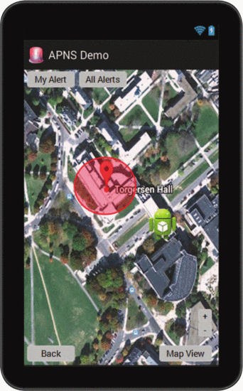
Figure 5. Map interface shown zoomed on earth view to user’s location and relevant alert.

Figure 6. Map interface shown zoomed out in map view of user’s location and relevant alert.

Figure 7. Interface for map shown zoomed out in map view of user’s location and all alerts.

Figure 8. Interface for alert details shown after selection of a map geofence.
As mentioned, the participants were guided through scenarios which involved five example interface paper prototype screens. Everyone was asked the same set of questions regarding their thoughts on the purpose of each screen, how the user would complete certain actions given the interface, and the actions which each user would expect when clicking on each of the available action buttons on the prototype of the map interface. During this portion of the interview the critical incidents for each participant were recorded and potential solutions for mitigating these incidents were included in a second design iteration of the interface. Several participants from the initial interview were asked to reassess this new interface with the new alterations. These critical incidents were cases where the user was either aware and confused about certain interface functionality or unaware that they had made an incorrect assumption regarding the functionality. Based on these incidents, we outlined several general issues that applied to our design of the alert interface and which could apply to other similar interfaces.
First, context is very important for the user understanding of the meaning of a certain interface screen or view. Our paper prototype limited the ability of a user to explore the functionality of the application, however, regardless of the format, users expressed concern that the titles and headings of the different application screens were too vague and confusing.
Second, our buttons and interface design were not completely consistent with common application patterns. For example, many participants could not locate their own position on the map, because it was not portrayed with a blue dot found on most map application for both iOS and Android. Finally, concerning the listing of the actual alert notification message, many users stressed the importance of the ordering of the fields. They believed the most important and critical information should be at the top. One user appropriately described this by saying “You would think that the sent and expiration would be further down the page. It should start with what I have to know.” These were all taken into consideration and our interface was redesigned and some participants were asked to complete a follow-up interview. The second iteration interface prototype screens are displayed in Figures 9–13. These follow-up interviews ultimately led to a third interface design.

Figure 9. New alert details interface.

Figure 10. New map interface shown zoomed on earth view to user’s location and relevant alert.

Figure 11. New map interface shown zoomed out in map view of user’s location and relevant alert.

Figure 12. New interface for map shown zoomed out in map view of user’s location and all alerts.

Figure 13. Interface for alert details shown after selection of a map geofence.
As we found out through comments by study participants, each prototype iteration and following usability study interview revealed information which was helpful towards increasing the ease of use of the application for our participants. Further, they gave more ideas for features and showed their enthusiasm towards and willingness to utilize such an application if it were to be released.
Future Work
Similar design methodologies can be applied and expanded to meet the needs of specific crisis, emergency, or other notification or communication systems. The added functionality of differentiating the notification messages by user location and allowing users to view notifications on a map is applicable and would strengthen alert systems of all levels. Perhaps even more valuable are the lessons we learned in communicating with a representative population of users from both our wide reaching usability survey of 1057 participants and our iterative and in-depth usability study of a smaller, but also a representative, set of actual users.
Geospatial location is the main criteria for organizing crisis alert notifications within this system design. Relative to the VT Alerts application, the university not only has a Blacksburg and Northern Virginia campus, but has a large population of students living off of the central campus. In the event of a crisis, users could be in immediate risk or headed toward an area in immediate risk and should be notified through a fast communication channel. This also leads to the need for message differentiation, as those in the midst of a situational crisis need different information and notifications than those too far to be affected. The strength of the design is the optimizations provided by being able to quickly send information to users, thanks to the almost instant sending capabilities of smart phone push notifications. If there is no known or relevant location for a crisis, then all groups can be notified independent of location quickly. Why not notify everyone with all the messages? First, different messages may be needed for specific groups of people in certain locations. Second, information overload and confusion may be controlled and avoided by sending appropriate and applicable messages.
Within the information systems field there are many interwoven considerations such as the communication channels chosen and user participation based on sociological factors, technological constraints and requirements, high stakes mental and physical safety concerns, varied user groups, and finally urgent and differing crisis triggering events. Designing a notification system should not just meet an end goal of notifying the users. How users are notified, the accuracy of information sent, the time it takes to notify everyone, the resulting actions of those notified, and many more questions could become pivotal requirements for the system depending on the situation. This design balances these factors and provides multiple functionality options to best adapt and efficiently notify a given user population, in this case a university, of a crisis. The system is not utilized for trivial updates, but a communication for crisis situations utilizing a smart phone application. We introduced the design of an efficient and optimized alert notification system both with regards to speed and system performance with the fast push notifications integrated with the current system processes, but also through interactions with the users through our usability survey and iterative usability studies. There is much more to efficiency and effectiveness than speed and our usability findings reiterate the care needed in design, implementation, and testing of the usability of emergency alert notification systems, specifically those tapping into the societal use of smartphone and mobile device applications.
Authors
are with Virginia Polytechnic Institute and State University, Blacksburg, VA. Email: kazeitz@vt.edu; marchany@vt.edu, jgtront@vt.edu.
 JOIN SSIT